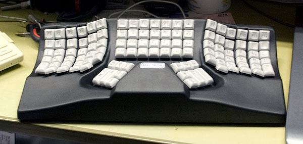
Having finally worked out how to write blogging software capable of containing the Vosathenik pages, I feel able to publish my page of thoughts about why I didn’t adapt to the Maltron keyboard. (Apart from a few grammatical edits this was mostly written in late 2014.)
In their defence, I have to say it was probably more to do with the structure of my fingers than anything else. The Maltron keyboard is based on some design principles which reflect usage assumptions which may be valid for some people, but not for me.

1. Long and Short Fingers
Some of us have longer fingers than others, some have relatively long third fingers, and some have relatively short fourth fingers. My impression is strongly that the Maltron was designed for a more even balance. I found using it less comfortable than a standard flat keyboard, partly because of the extra tendon strain involved in keeping my third fingers out of the way. Conversely, with a flat keyboard, I get on reasonably well by angling my fingers over so that they meet the keys with a similar level of tension, though the Vosathenik layout now helps with that.
2. Bendy Fingers
The Maltron design correctly recognises that:
- our fingers do not telescope, but contract and extend in arcs when typing,
- as they do so they do not all move in parallel,
- the final ‘straight’ angle of our fingertips varies laterally along the arc.
But it is built for an average hand in this respect too. Even the (nominally high-quality and expensive) spherically indented key caps they use can’t quite resolve this problem. In fact, the key caps seem to be part of the problem, as they are of uniform size, only positioned at different angles. To allow for the actual non-parallel motion of our fingertips you would either need very small keycaps or some size variation. And Maltron seem to think that our fingers point out laterally to a concave curve when typing; to me it seems that pointing slightly in to a convex curve would be more useful, at least for part of the perpendicular arc.
3. Pointy Fingers
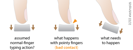
The Maltron design appears to assume that finger-key contact is near perpendicular. From memory, I think they say something about this helping to balance extensor and contractor muscle use, especially when using the top row keys. This doesn’t work so well for me, as I have rather protuberant fingernails — not long fingernails, but ones which grow out to the tips rather than stopping somewhere further back. Putting that slightly differently, unlike some people I know, I do not have large fleshy fingertips, but skinny, bony, pointy ones, with projecting horn blades which can easily slip on (and damage) the keys, and which have no touch sensitivity. Optimally, I need to press the keys with my fingertips at about 20°–50° (varies by finger) from the perpendicular — so the finger keys need to be angled back — which more or less happens with ‘stepped’ rows of keys on older plain keyboards. (But not on laptop, or recent flat and reduced key-height keyboards.) The thumb keys need to be angled forward slightly or be perfectly horizontal — which is not the Maltron approach, though I’m not clear why.

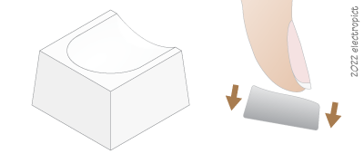
While writing this I have realised that the ‘spherical’ key caps — curved in two rather than one dimension — were probably part of this problem. Most keyboards I use have ‘cylindrical’ curves. I can see that the ‘spherical’ curve would make the keys easier to use in some ways, but not for my fingertips. I might still use spherical caps if the keys were appropriately angled. I don’t know if anyone has ever made ‘saddle’ key caps . . . ? A combined spherical/saddle cap might be the best possible design:

This might reduce the required contact angle by 10°–20°. It still wouldn’t deal with the whole extensor/contractor muscle (and tendon) issue, but I think it would be less strenuous in effect as it would promote a more relaxed typing action, which could have benefits from finger to shoulder.
4. Auxiliary Keys
Although having a whole bunch of keys in the middle of the keyboard is convenient in a sense, they aren’t easy to use there, as they’re not immediately in reach of, or aligned with either hand. This makes the numeric keypad particularly difficult to use. I came to think that one of their single-hand keyboards might be better for my purposes, at least for use alongside a mouse and pen. However, I would still have the other problems. (And in any case, I would really like a hexadecimal keypad.)
5. Overreaching Myself
While this may not have been so relevant for the first iteration of the Maltron design in the 1970s, modern computing input makes extensive use of modifier keys. The position of the modifier keys needs to be convenient and ergonomic, and this is something that Maltron don’t seem to have addressed, any more than most other manufacturers. As we also use mice and trackpads now, the modifier keys need to be positioned (and shaped) so that any alphanumeric key can be used simultaneously with any combination of modifier keys, all using one hand. This of course is a significant design challenge. (Though mice and trackpads with enough additional buttons to replicate the modifier keys certainly help in this regard. That’s four for a standard Mac, in addition to the click button. After that you need a sixth finger anyway.)
The Maltron is not an unusually bad keyboard in this sense. Here’s a picture of a one-handed option-shift-delete, the worst usable combination I know of, under way on my MacBook. This is the kind of thing I’d really like to avoid . . . it hurts:

It’s not obvious, but the left-command key is slightly (but not quite functionally) depressed in this stretch. This is really not good, but sometimes you have to hold something with the other hand — often the laptop. For our shorter-fingered siblings it gets progressively worse, with painful stretches required for more combinations. The next worst combinations include ⌥⇧] for ⟨”⟩, which I use fairly frequently, and which on a good day I can manage single-handed. Some can’t.
MacOS does enable ‘sticky’ modifier keys, but that’s an extra ten keypresses to turn on and off, just to do some of these option-stretches. And leaving it on (even leaving it switchable) can be quite a nuisance with some applications. Which is why some people hack their systems to turn the enter key into a right-option key. I wonder if the generally useless Num-Lock key could be turned into an option/enter mode key . . . ? Or just an option-lock? Or just a sticky-mode on/off switch? Actually . . . I’ve just realised: I want it to act as a Compose key, don’t I?
So design challenge or no, I intend that my modifier keys (on my keyboard, when I get to the point of building it) should be available from all points on the keyboard, one-handed. I’ve never had one, but I think a ‘mode lock’ key would also be nice. But a Compose key would sort the character combinations.
Update notes, 2022-01-26: That laptop finally packed up a couple of years ago, and I have gotten nowhere with keyboard-building, since [life]. Another consequence is, I don’t think I could do the ⌥⇧⌫ any more, but the replacement has two option keys so I’m managing.
Comment or Question about this page? write
Article text ©2022 Electropict  .
.
Click images for individual licences.
